Case study
Advocate
Client: Advocate
Year: 2024
- UX/UI design
- Web development
Redefining fintech with Advocate's new website
The challenge
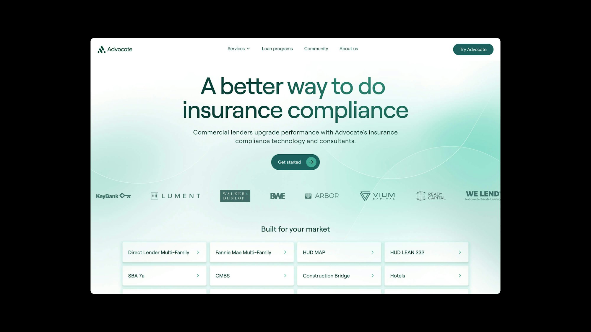
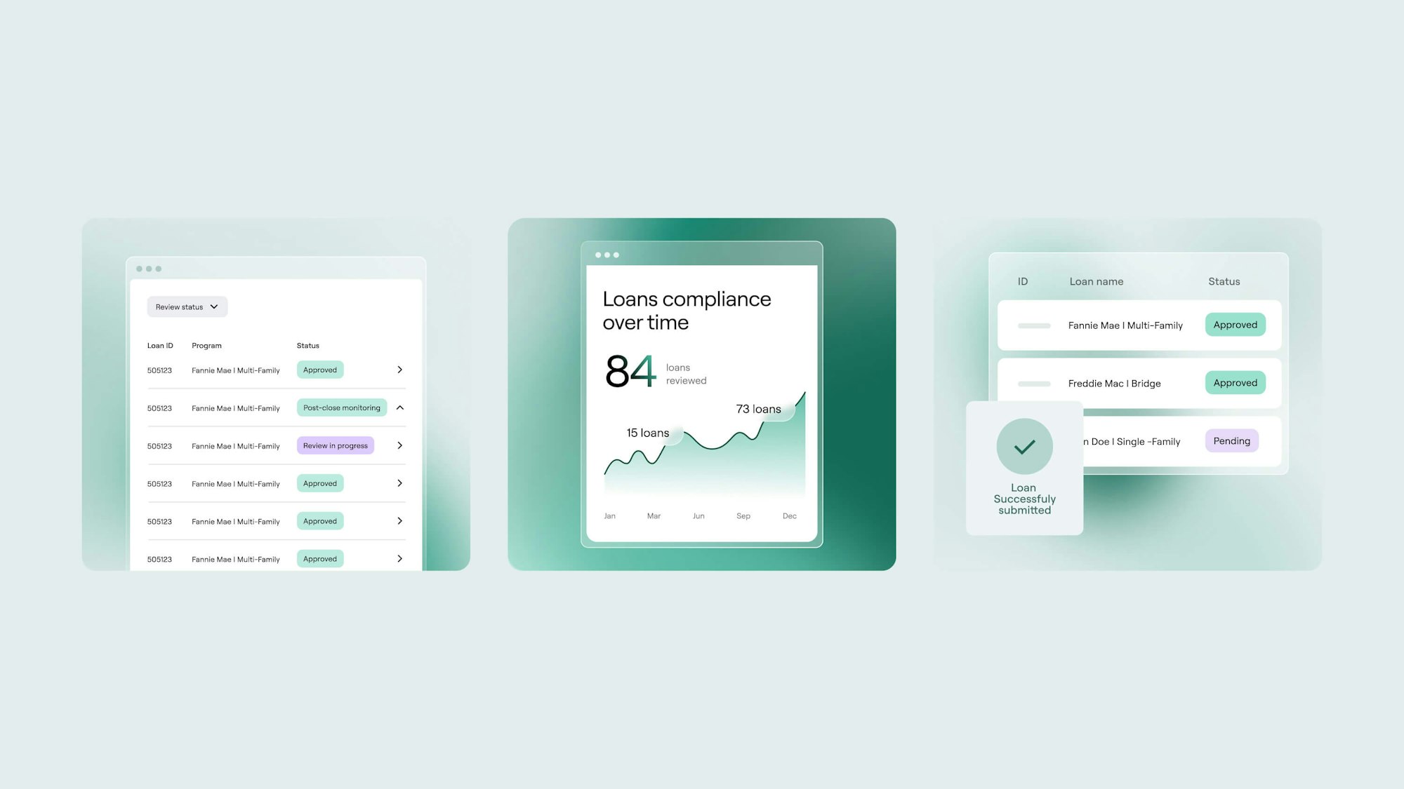
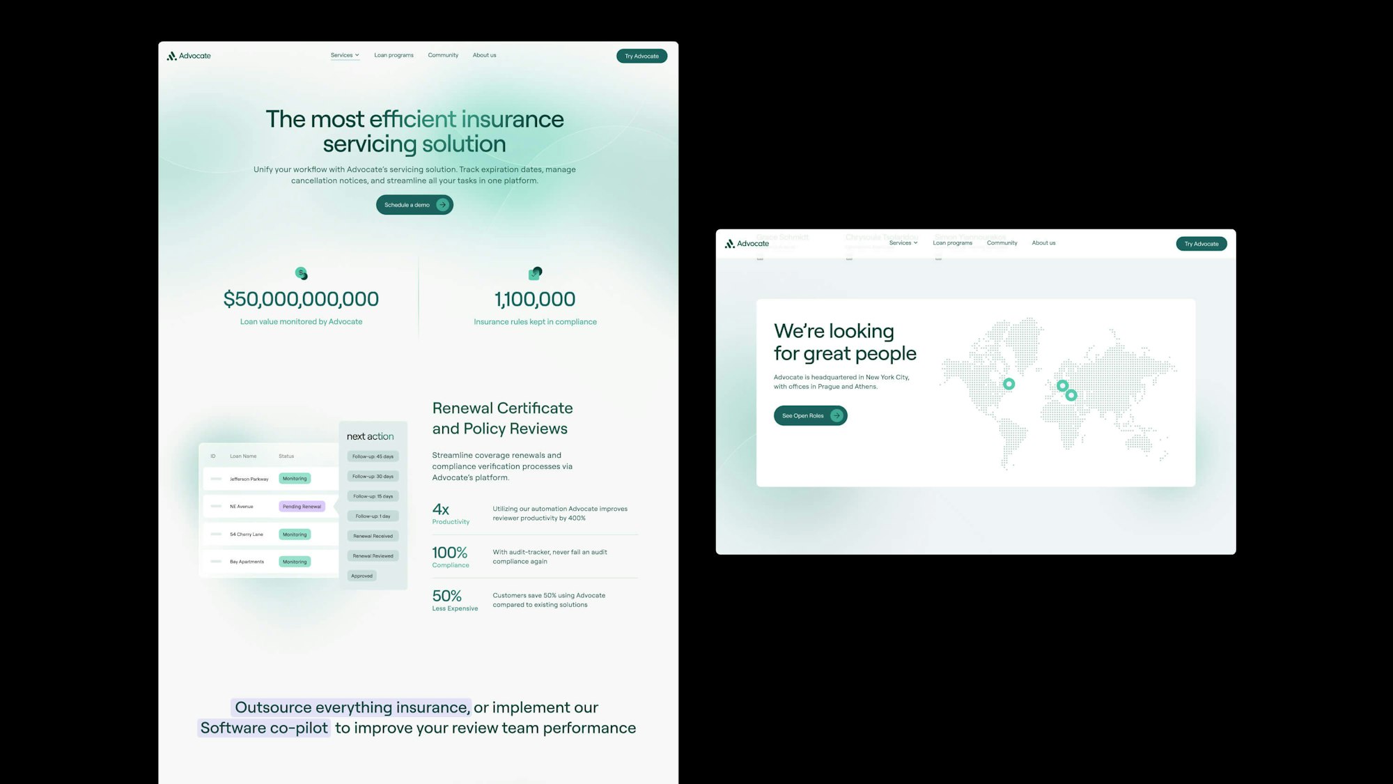
In the redesign of Advocate's website, the project confronted the challenge of integrating cutting-edge technology with the conservative nature of our target audience—banking institutions. This required a thoughtful approach to ensure the design resonated with their traditional values. Furthermore, the complexity of the financial topics presented required that we use detailed illustrations to demystify abstract terms, making the information more accessible and engaging for all users.
The solution
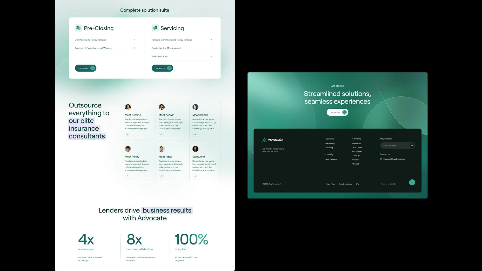
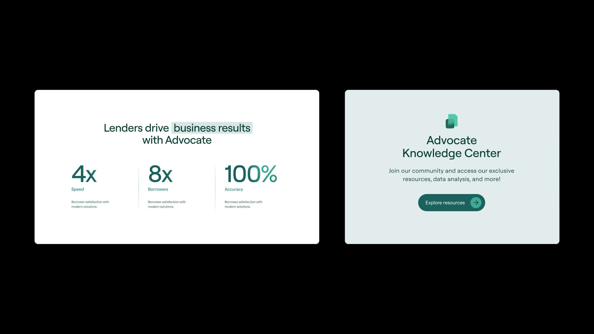
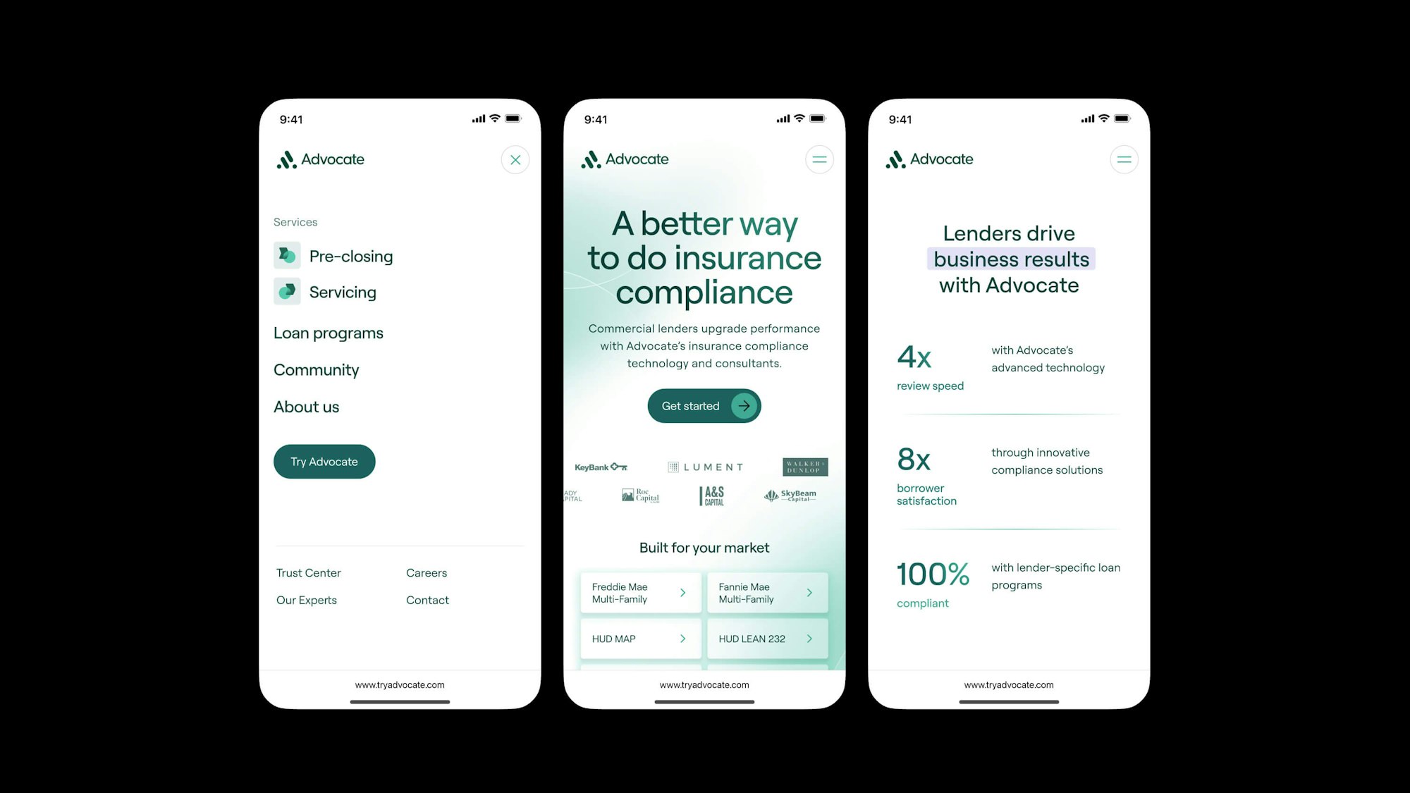
We developed a visual language that strikes a balance between modern flair and serious professionalism, appealing to the sophisticated palette of financial institutions. The information architecture was carefully crafted to guide users seamlessly to the services most relevant to them, ensuring a user-friendly experience even with complex financial content. To make dense information easily digestible, we structured it in a straightforward, accessible format. Technically, the website was built on Strapi, providing the flexibility needed to manage content effectively while adhering to internal engineering standards.
